2010 ADA Standards for Accessible Design
Department of Justice September 10, 2010
Enforced beginning March 15, 2012
Excerpts: Raised Text & Braille requirements
Subject: Signs
ADA CHAPTER 7: COMMUNICATION ELEMENTS AND FEATURES
703 Signs
Raised Text
703 Signs703.1 General. Signs shall comply with 703. Where both visual and tactile characters are required, either one sign with both visual and tactile characters, or two separate signs, one with visual, and one with tactile characters, shall be provided.
703.2 Raised Characters. Raised characters shall comply with 703.2 and shall be duplicated in braille complying with 703.3. Raised characters shall be installed in accordance with 703.4.
Advisory 703.2 Raised Characters. Signs that are designed to be read by touch should not have sharp or abrasive edges.
703.2.1 Depth. Raised characters shall be 1/32 inch (0.8 mm) minimum above their background.
703.2.2 Case. Characters shall be uppercase.
703.2.3 Style. Characters shall be sans serif. Characters shall not be italic, oblique, script, highly decorative, or of other unusual forms.
703.2.4 Character Proportions. Characters shall be selected from fonts where the width of the uppercase letter “O” is 55 percent minimum and 110 percent maximum of the height of the uppercase letter “I”.
703.2.5 Character Height. Character height measured vertically from the baseline of the character shall be 5/8 inch (16 mm) minimum and 2 inches (51 mm) maximum based on the height of the uppercase letter “I”.
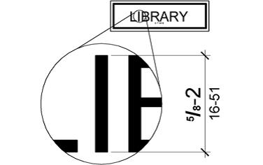
EXCEPTION: Where separate raised and visual characters with the same information are provided, raised character height shall be permitted to be ½ inch (13 mm) minimum.
703.2.6 Stroke Thickness. Stroke thickness of the uppercase letter “I” shall be 15 percent maximum of the height of the character.
703.2.7 Character Spacing. Character spacing shall be measured between the two closest points of adjacent raised characters within a message, excluding word spaces. Where characters have rectangular cross sections, spacing between individual raised characters shall be 1/8 inch (3.2 mm) minimum and 4 times the raised character stroke width maximum. Where characters have other cross sections, spacing between individual raised characters shall be 1/16 inch (1.6 mm) minimum and 4 times the raised character stroke width maximum at the base of the cross sections, and 1/8 inch (3.2 mm) minimum and 4 times the raised character stroke width maximum at the top of the cross sections. Characters shall be separated from raised borders and decorative elements 3/8 inch (9.5 mm) minimum.
703.2.8 Line Spacing. Spacing between the baselines of separate lines of raised characters within a message shall be 135 percent minimum and 170 percent maximum of the raised character height.
BRAILLE
703.3 Braille. Braille shall be contracted (Grade 2) and shall comply with 703.3 and 703.4.
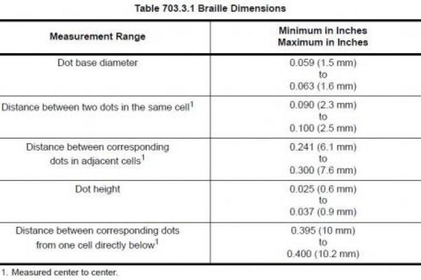
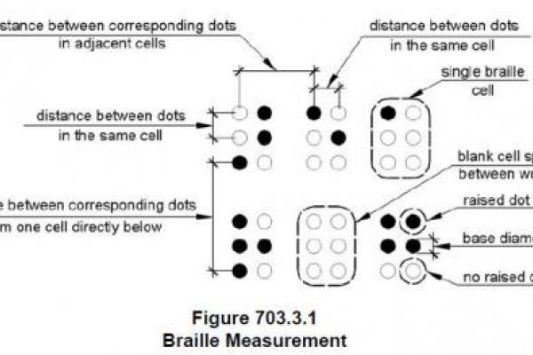
703.3.1 Dimensions and Capitalization. Braille dots shall have a domed or rounded shape and shall comply with Table 703.3.1. The indication of an uppercase letter or letters shall only be used before the first word of sentences, proper nouns and names, individual letters of the alphabet, initials, and acronyms.
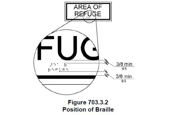
703.3.2 Position. Braille shall be positioned below the corresponding text. If text is multi-lined, braille shall be placed below the entire text. Braille shall be separated 3/8 inch (9.5 mm) minimum from any other tactile characters and 3/8 inch (9.5 mm) minimum from raised borders and decorative elements.
VISUAL CHARACTER REQ’TS
703.5 Visual Characters. Visual characters shall comply with 703.5.
703.5.1 Finish and Contrast. Characters and their background shall have a non-glare finish. Characters shall contrast with their background with either light characters on a dark background or dark characters on a light background.
Advisory 703.5.1 Finish and Contrast. Signs are more legible for persons with low vision when characters contrast as much as possible with their background. Additional factors affecting the ease with which the text can be distinguished from its background include shadows cast by lighting sources, surface glare, and the uniformity of the text and its background colors and textures.